Customize style and appearance
You can align Airwallex checkout UI with your site across Hosted Payment Page, Drop-in element, Embedded elements (including Card / Split card), and the Apple Pay and Google Pay wallet buttons.
You can customize the look and feel of Hosted Payment Page using the following objects: appearance JS and layout JS.
theme object has been deprecated in @airwallex/components-sdk version 1.19.1, use the appearance object instead.
appearance
You can customize the appearance of your page to match the design of your website using the following customization options:
-
mode: The appearance mode for the page. Acceptsdarkorlightmodes where each mode provides a different color variable preset and color generation logic. Defaults tolight. -
variables: Set variables to customize the appearance of the page. Supports three color keys that accept RGB or HEX color formats.colorBackground: Sets the primary text color. This option automatically generates a comprehensive color set, including secondary text, inverse text, disabled text, placeholder text, and more. Defaults to#14171a(light mode) and#F5F6F7(dark mode).colorBrand: Sets the main accent color used for the page such as buttons, text links, focus borders, interactive backgrounds, highlights, etc. This color defines your brand's visual identity in the element. Defaults to#612fff(light mode) and#ABA8FF(dark mode).colorText: Sets the primary background color. This option automatically generates a complete set of background colors, including primary, secondary, field, and disabled backgrounds. Defaults to#ffffff(light mode) and#14171A(dark mode).
1redirectToCheckout({2 intent_id: 'replace-with-your-intent-id',3 client_secret: 'replace-with-your-client-secret',4 currency: 'USD',5 country_code: 'US',6 appearance: {7 mode: 'dark',8 variables: {9 colorBrand: '#612FFF',10 colorBackground: '#14171A',11 colorText: '#FFFFFF',12 }13 }14});
layout
The layout object supports two options:
alwaysShowMethodLabel: By default (false), the payment method icon is hidden when only one payment method is available. Set totrueto always display the payment method icon.type: Specify the layout for the payment elements. Defaults toaccordionandtablayout on desktop and mobile interfaces respectively.
1redirectToCheckout({2 intent_id: 'replace-with-your-intent-id',3 client_secret: 'replace-with-your-client-secret',4 currency: 'USD',5 country_code: 'US',6 layout: {7 type: "accordion"8 }9});
Accordion layout on Desktop 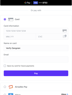 | Accordion layout on Mobile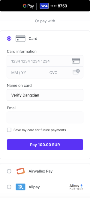 |
Tab layout on Desktop 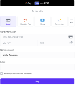 | Tab layout on Mobile 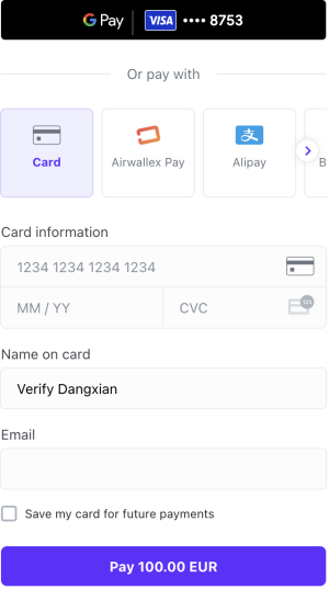 |
You can customize the look and feel of the Drop-in element JS using the following objects: appearance JS and layout JS.
theme and style objects have been deprecated in @airwallex/components-sdk version 1.19.1, use the enhanced appearance object instead.
appearance
You can customize the appearance of your element to match the design of your website using the following customization options:
-
mode: The appearance mode for the element. Acceptsdarkorlightmodes where each mode provides a different color variable preset and color generation logic. Defaults tolight. -
variables: Set variables to customize the appearance of the element. Supports three color keys that accept RGB or HEX color formats.colorBackground: Sets the primary text color. This option automatically generates a comprehensive color set, including secondary text, inverse text, disabled text, placeholder text, and more. Defaults to#14171a(light mode) and#F5F6F7(dark mode).colorBrand: Sets the main accent color used for elements such as buttons, text links, focus borders, interactive backgrounds, highlights, etc. This color defines your brand's visual identity in the element. Defaults to#612fff(light mode) and#ABA8FF(dark mode).colorText: Sets the primary background color. This option automatically generates a complete set of background colors, including primary, secondary, field, and disabled backgrounds. Defaults to#ffffff(light mode) and#14171A(dark mode).
-
rules: Fine tune individual elements and states by specifying custom CSS properties using rules. The following classes and pseudo-classes can be styled using rules..Button:CSSProperties.Button:hover:CSSProperties.GooglePayButton:CSSProperties.GooglePayButton:hover:CSSProperties.ApplePayButton:CSSProperties.ApplePayButton:hover:CSSProperties.Input:CSSProperties.Input:hover:CSSProperties.Input:active:CSSProperties
1createElement('dropIn', {2 appearance: {3 mode: 'dark',4 variables: {5 colorBrand: '#612FFF',6 colorBackground: '#14171A',7 colorText: '#FFFFFF',8 },9 rules: {10 '.Button': {11 width: '100px',12 height: '40px',13 }14 }15 },16});
layout
The layout object supports two options:
alwaysShowMethodLabel: By default (false), the payment method icon is hidden when only one payment method is available. Set totrueto always display the payment method icon.type: Specify the layout for the payment elements. Defaults toaccordionandtablayout on desktop and mobile interfaces respectively.
1createElement('dropIn', {2 intent_id: intent.id,3 client_secret: intent.client_secret,4 layout: {5 type: 'accordion',6 },7 currency: 'USD',8});
| Accordion layout on Desktop | Accordion layout on Mobile |
| Tab layout on Desktop | Tab layout on Mobile |
style (deprecated)
Provide base styling for the iframe using CSS properties. You can also customize the width and height of a pop-up overlay, e.g., payment with 3-D Secure authentication.
1createElement('dropIn', {2 style: {3 base: {4 border: '5px solid red',5 borderRadius: '4px',6 background: 'black',7 },8 popupWidth: 400,9 popupHeight: 600,10 },11})
For Card element and Split Card element, pass a style JS object into createElement() for each embedded field. This uses iframe base styling (including placeholder pseudo-elements) rather than the appearance / layout model used by Hosted Payment Page and Drop-in element.
Card element
Provide base styling for the iframe using CSS properties. You can also customize the width and height of a pop-up overlay, e.g., payment with 3-D Secure authentication.
1createElement('card', {2 style: {3 base: {4 '::placeholder': {5 color: 'red',6 }7 },8 },9 popupWidth: 400,10 popupHeight: 600,11})
Split Card element
Apply style JS to each element (cardNumber, cardExpiry, cardCvc):
1createElement('cardNumber', {2 style: {3 base: {4 '::placeholder': {5 color: 'red',6 },7 },8 },9 popupWidth: 400,10 popupHeight: 600,11});
For the Apple Pay element, pass style, appearance, buttonType, and buttonColor into createElement('applePayButton', options) JS.
style
Provide base styling for the iframe using CSS properties.
1createElement('applePayButton', {2 base: {3 background: 'black',4 },5});
appearance
Fine tune individual Elements and states by specifying custom CSS properties using rules. The following classes and pseudo-classes can be styled using rules.
.ApplePayButton: CSSProperties.ApplePayButton:hover: CSSProperties
1createElement('applePayButton', {2 appearance: {3 rules: {4 '.ApplePayButton': {5 width: '100px',6 height: '40px',7 },8 },9 },10});
buttonType
The buttonType option supports the following values: add-money | book | buy | check-out | continue | contribute | donate | order | pay | plain | reload | rent | set-up | subscribe | support | tip | top-up
1createElement('applePayButton', {2 buttonType: 'book',3});
buttonColor
The buttonColor option supports the following values: black | white | white-outline
1createElement('applePayButton', {2 buttonColor: 'white',3});
For the Google Pay element, pass style, appearance, buttonType, buttonColor, and buttonSizeMode into createElement('googlePayButton', options) JS.
style
Provide base styling for the iframe using CSS properties. You can also customize the width and height of a pop-up overlay, for example payment with 3-D Secure authentication.
1createElement('googlePayButton', {2 base: {3 background: 'black',4 },5 popupWidth: 400,6 popupHeight: 600,7});
appearance
Fine tune individual elements and states by specifying custom CSS properties using rules. The following classes and pseudo-classes can be styled using rules.
.GooglePayButton: CSSProperties.GooglePayButton:hover: CSSProperties
1createElement('googlePayButton', {2 appearance: {3 rules: {4 '.GooglePayButton': {5 width: '100px',6 height: '40px',7 },8 },9 },10});
buttonType
The buttonType option supports the following values: book | buy | check-out | donate | order | pay | plain | subscribe | long | short
1createElement('googlePayButton', {2 buttonType: 'book',3});
buttonColor
The buttonColor option supports the following values: default | black | white
1createElement('googlePayButton', {2 buttonColor: 'white',3});
buttonSizeMode
The buttonSizeMode option supports the following values: static | fill
1createElement('googlePayButton', {2 buttonSizeMode: 'static',3});